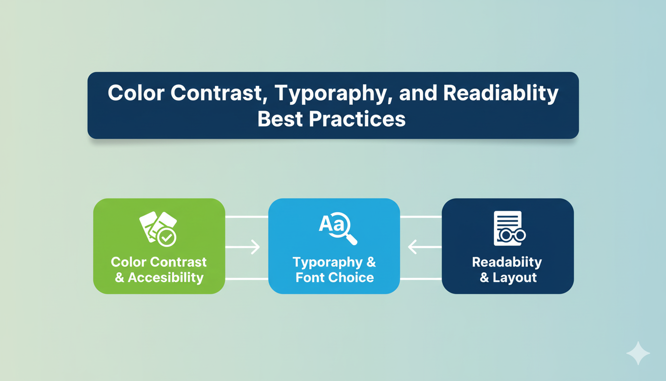
Color Contrast, Typography, and Readability Best Practices

When designing websites, color contrast accessibility and readable typography play a crucial role in ensuring inclusivity. Many users with low vision, color blindness, or cognitive disabilities rely on clear, well-structured text to interact with digital content.
Ignoring these elements is not only poor design—it can also violate ADA website compliance and ADA legal requirements for websites. Accessible design ensures every visitor can consume content without unnecessary barriers.
Why Color Contrast Matters
Color is often the first element that creates accessibility challenges. People with low vision or color blindness may struggle if text blends into the background. Following WCAG color contrast standards ensures enough difference between text and background to maintain readability.
This is one of the most overlooked yet critical website accessibility best practices.

Typography Accessibility Guidelines
Typography directly impacts how readable content is for users with cognitive disabilities or visual impairments. Typography accessibility guidelines recommend using simple, sans-serif fonts, adequate line spacing, and consistent text hierarchy.
Good typography is about more than style—it ensures content remains clear and scannable across devices and screen sizes.
Readability for Cognitive Disabilities
People with dyslexia, ADHD, or other cognitive challenges often struggle with cluttered or complex text. Readability for cognitive disabilities means breaking down content into shorter paragraphs, using plain language, and avoiding jargon.
These small adjustments improve usability for everyone while aligning with ADA compliance checklist requirements.
Common ADA Compliance Issues in Text
Some of the most frequent common ADA compliance issues related to text and readability include:
- Low color contrast.
- Tiny font sizes.
- Lack of headings or logical hierarchy.
- Overuse of decorative fonts.
- Dense paragraphs with no spacing.
Addressing these issues prevents accessibility barriers and improves the overall user experience.

WCAG Color Contrast Standards
The WCAG color contrast standards provide clear ratios for compliance. For normal text, a minimum contrast ratio of 4.5:1 is required, while large text needs at least 3:1. Meeting these standards ensures compliance with ADA website compliance rules.
This measurable guideline helps designers avoid guesswork and create accessible visuals.
Accessible Web Design Tips for Fonts
Some accessible web design tips for fonts include using at least 16px as the base size, ensuring adequate line spacing (1.5x), and limiting the number of font styles on a page.
By following these practices, websites become easier to read and more inclusive for users with low vision or cognitive challenges.
Navigation and Readability
Navigation also impacts readability. Clear, consistent headings and properly styled links improve scanning and help screen readers interpret the structure. This aligns with website accessibility best practices while preventing confusion for users with disabilities.
Readable navigation is just as important as readable text.

ADA Compliance Checklist for Readability
A strong ADA compliance checklist for readability should include:
- Testing color contrast with tools.
- Setting accessible font sizes.
- Using clear headings and labels.
- Writing in plain language.
- Checking alignment with WCAG color contrast standards.
This checklist helps designers build accessible content from the ground up.
ADA Legal Requirements for Websites
The ADA legal requirements for websites establish that digital content must be accessible to people with disabilities. Courts have repeatedly ruled that inaccessible text, color, and design elements fall under ADA violations.
Ignoring these requirements exposes businesses to lawsuits, penalties, and reputational harm.
Benefits Beyond Compliance
Prioritizing color contrast accessibility and typography not only prevents lawsuits—it also enhances usability for all users. Accessible content increases engagement, reduces bounce rates, and improves SEO.
This is where accessibility and business goals intersect.

Conclusion
Designing with color contrast accessibility, typography accessibility guidelines, and readability for cognitive disabilities ensures that websites meet both legal and ethical standards. Following WCAG color contrast standards and maintaining a strong ADA compliance checklist helps businesses achieve full ADA website compliance.
Accessible text and design are not just about compliance—they’re about creating inclusive digital spaces where everyone can participate.
.svg)